Findify
About
The Netherlands has one of the most competitive rental markets in Europe. Apartments disappear within hours. Renters check five different platforms, manually re-enter their details for every application, & still lose out because they saw the listing too late.
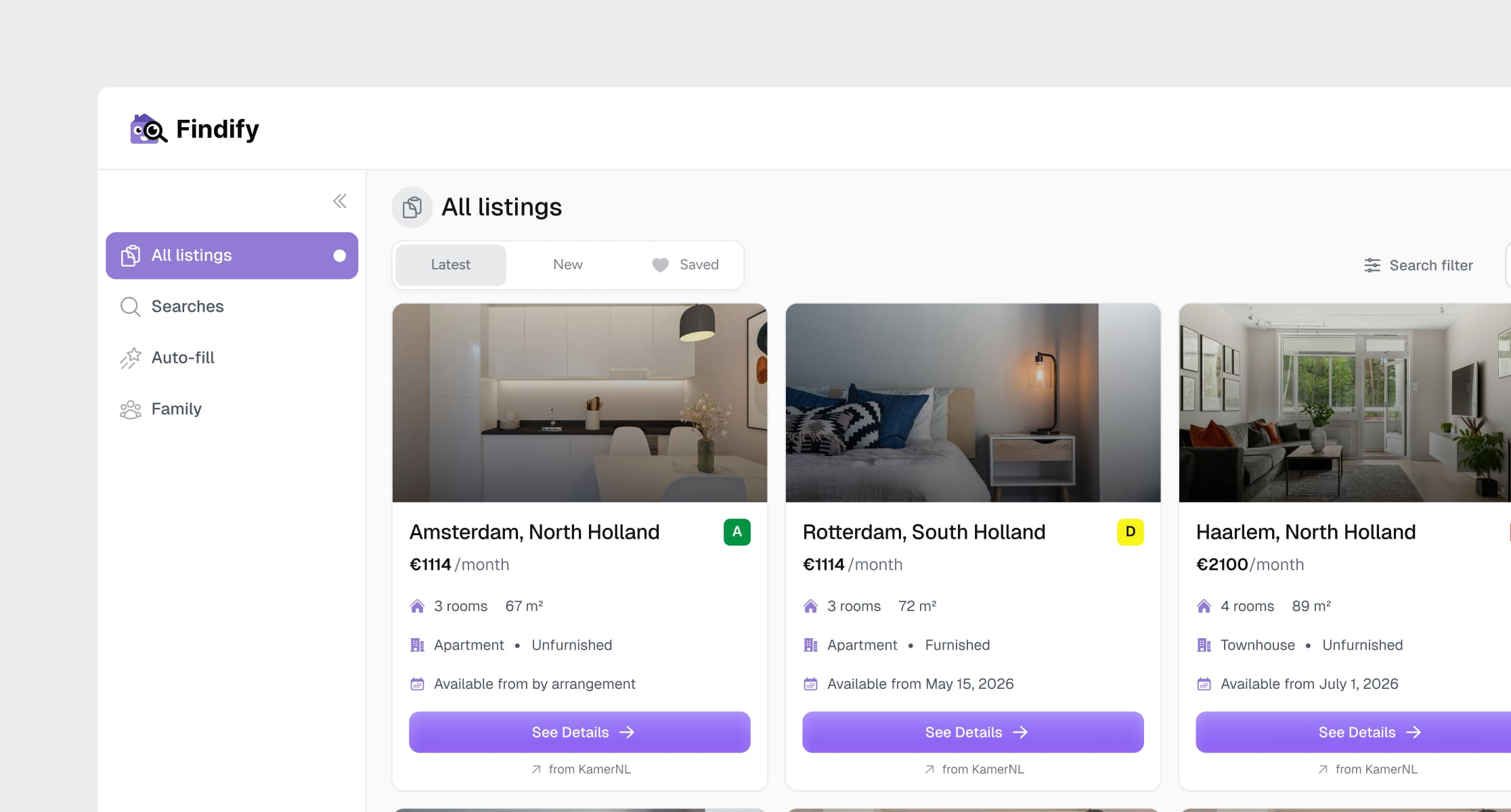
Findify is a B2C rental platform built specifically for this market, aggregating listings across sources, automating applications, and alerting renters the moment something matches their criteria. The product had strong mobile traction. My job was to bring the full experience to web without losing what made it work.
Problem ⊙
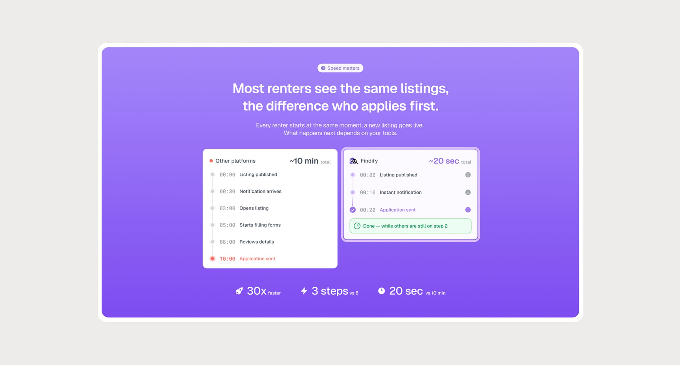
The mobile app was doing something genuinely valuable — saving searches, sending instant alerts, one-tap applications with a pre-filled profile. The web version had none of it. Someone would discover Findify on desktop, find an apartment they liked, & have nowhere to go. No way to save the search, no way to apply, no way to come back.
How Might We
How might we bring the intelligence of the mobile experience to web, not by porting screens, but by rethinking what the larger canvas actually enables?
#1 Highlight
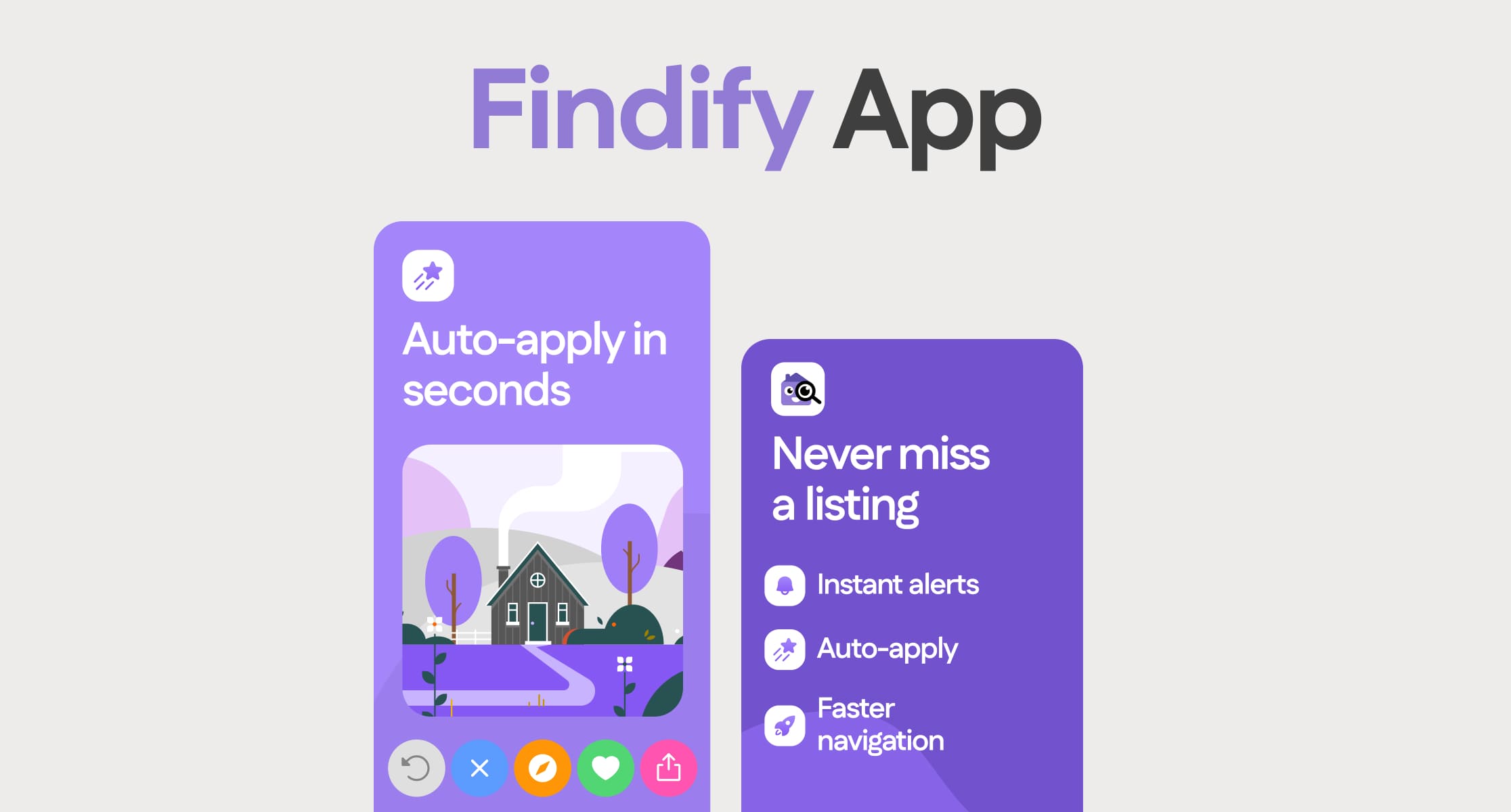
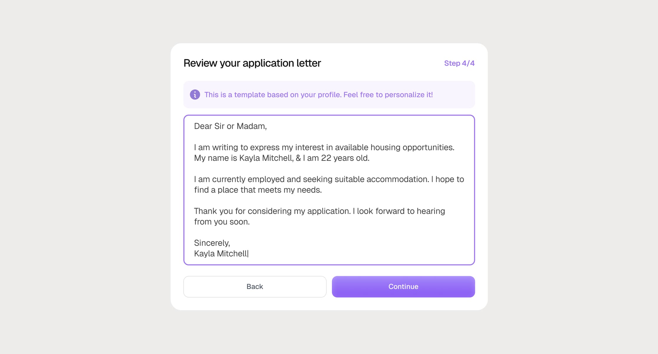
One Profile, Every Application
The auto-fill system was the product's strongest feature on mobile: fill in your details once, apply anywhere with one tap. Translating this to web meant designing a profile creation flow that felt worth completing, & an application flow that felt fast enough to be trusted.
Solution
The key UX decision: the profile had to feel like an investment, not a form. I designed it as a sequence of meaningful steps rather than a wall of fields; each one clearly connected to a faster application on the other side.
User goal → Apply before the apartment disappears. Don't lose time re-entering the same information.
Product goal → Make auto-fill the reason users subscribe, the product's clearest value proposition expressed as a flow.
#2 Highlight
Saved Searches & Instant Alerts
The mobile app's alert system was its killer feature — the moment a listing matches your criteria, you know about it. The web had no equivalent. Building this on desktop meant designing a saved search system that felt deliberate to set up and invisible to maintain.
Solution
Saved searches were designed as persistent filters — set once, run always. The alert preferences were surfaced inline with the search rather than buried in settings, making the connection between action and outcome immediate.
User goal → Never miss a listing that matches. Stop checking five platforms manually every morning.
Product goal → Make the alert system the reason users return to the web product daily, not just when they remember to check.
Reflection
Findify is a focused product solving a real regional problem, not a general-purpose rental app, but something built specifically for how the Dutch market works. The design challenge wasn't complexity; it was fidelity. Taking what worked on mobile and making it feel native on web, not just functional.